FinTab was created out of the embers of my burning hatred for trying to do some simple stock research, and becoming completely inundated with ads and superfluous data. As all great products that are created out of necessity we eventually decided to start building features that we couldn't find anywhere else. We decided to create a 3 month predictive stock algorithm that predicts the change in stock price. Below is how we built & designed our model, the trouble that occurred, and most importantly- how it performed.
Disclaimer: I don't think I have to say it, but here it goes- none of this is investment advice. As you'll find in the rest of the blog post we are just learning as we go. We just want to build cool things that we want to use and we hope it helps you too. Do your own research.
Why 3 Months?
Firstly, as previously mentioned- we decided to build a 3 month predictive stock algorithm. I'm not really the type of person that wants to buy & sell stock every day. Different strokes for different folks. Three months seemed like a good duration of time to let a stock "do its thang"- in other words, correct after earnings, gradual increases/ decreases, ratings upgrades, yada, yada. It seemed like this would be a good duration of time to let the underlying financial data speak for itself. And, that is how we plan to train our models, with financial data.
"In the short run, the market is a voting machine. But in the long run, it is a weighing machine."
- Benjamin Graham
The Data We Have Access To
This is the data we have access to:
- Date
- Daily Open
- Daily High
- Daily Low
- Daily Close
- Daily Volume
- Trailing P/E (Price-to-Earnings)
- Forward P/E (Price-to-Earnings)
- Price-to-Book
- Profit Margins
- Return on Equity (ROE)
- Debt-to-Equity
- Current Ratio
- Quick Ratio
- Free Cash Flow
- Operating Cash Flow
- Book Value
- Total Cash Per Share
- Dividend Yield
- Dividend Rate
- Revenue Growth
- Earnings Growth
- Return on Assets (ROA)
The API we're using allows us to have 5 years of this stuff.
Finding the Right AI Model
Ok, so we have data now, we need to find an AI model.
There's this dope site called Hugging Face we used as inspiration.
And we just started plugging in our data to these available models to see what our results would be.
The LSTM models in particular caught our attention: LSTM Stock Price Predictor. You can read more about them here.
The best way to test your model is to use historical data from, let's say, a year back, and then run the model for the same date range and look for the correlation between historical price and predicted price.
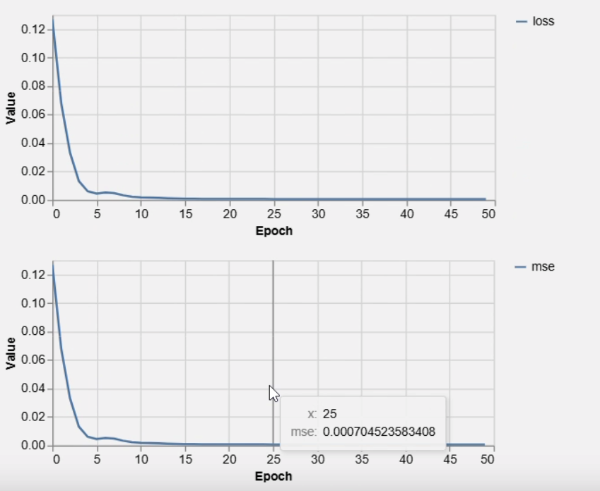
Initial Challenges
After some additional testing we decided that this model wasn't going to really cut it for our needs. We couldn't get it to predict much past one day- if you couldn't tell.
We started to get closer. It became apparent that it wasn't the data we lacked, but how we were training the model. If May 26th was positive, you could bet the predicted forecast was going to be positive for May 27th. Our model lacked the ability to predict alternative trends. Folks in the industry call this "naive persistence".
LSTM vs Dense Models
We decided to try a "LSTM Model" instead of Dense- basically instead of just sending price and volume data, adding more data so that AI can learn patterns. Other than the fundamentals, we started to send indicators like MACD and RSI in hopes that AI could start to detect when a stock has been "overbought" or "oversold".
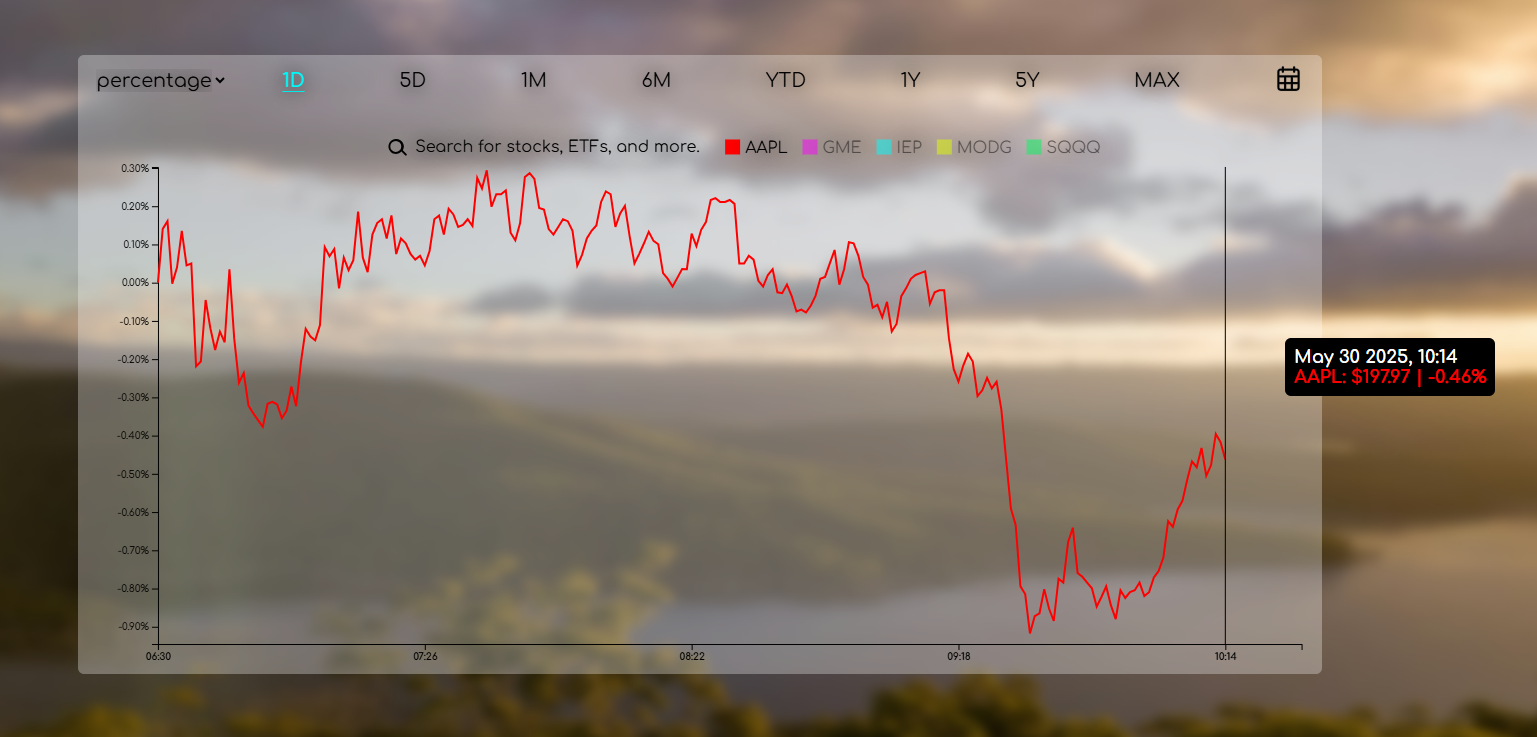
AAPL Prediction Example (05/27/2025)
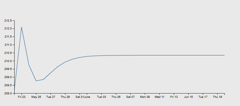
After adding in MACD we started to see something exciting. A down line! How many people in the stock market can say they've been excited about that? You'll also notice the wave.
And sure as a pigeon will ruin a clean shirt, the next day- the stock went down.
Overall, LSTM always provided more correct direction, but Dense models provided more short term accurate results. However, it only worked with less technical data. With the current data and other things that are in place, we're using a combination of both.
LSTM by definition, is meant to remember and store; Dense layers carry no context from the previous prediction. Each time we tried Dense, we always wondered why it is more accurate? But, we realized that the market, in a way, is also a hybrid. What's going to happen today or tomorrow can only be predicted by indicators, but when a new day comes, everyone knows it all depends on that day, regardless of what happened yesterday.
Testing Our Predictions
We really seemed to start having some strong correlation, barring dramatic spikes with historical data.
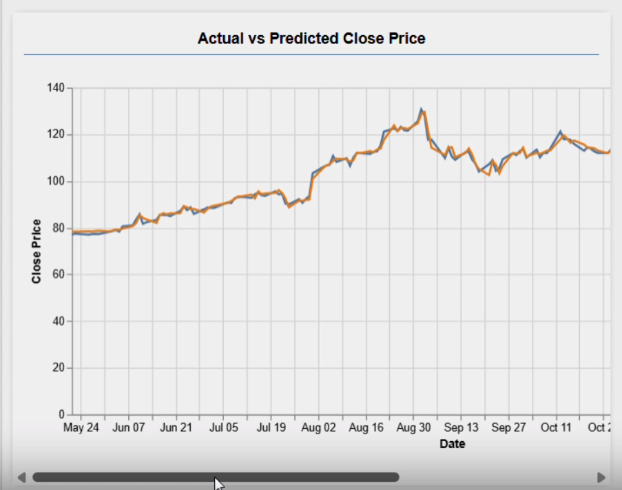
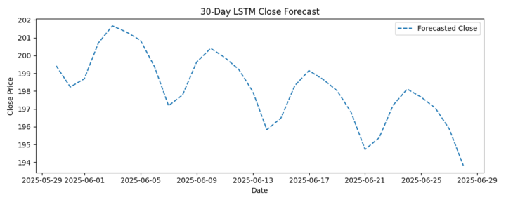
So we started trying some 1 month forecasting (AAPL): This looked like the best forecasting prediction we've had so far! We got excited, so we decided to try Microsoft (MSFT).
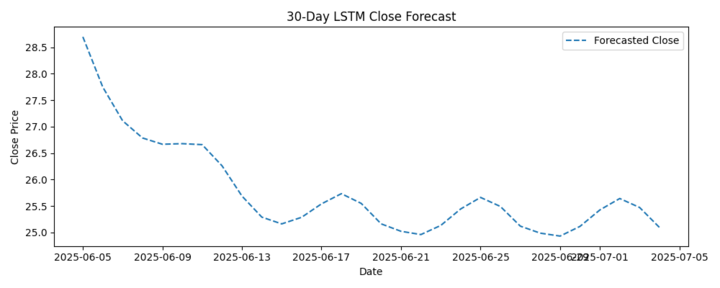
This was starting to look seriously promising, but we thought to ourselves, "Well, shit- it only predicts all stocks to be bearish." So, again for the sake of all those people silently depending on us- we tried another stock.
For some reason we tried Gamestop (GME) just to see if we could see some volatility. And you wouldn't believe what we saw. That SOB was going down too. Ok, well we'll try one more before we throw away our work. We tried Shopify (SHOP).
AND BRING OUT THE TEARY EYE EMOJIS IT'S NOT GOING DOWN!! We were overjoyed. Not going strictly down, and not going strictly up. We're still anticipating a letter from the Nobel Academy.
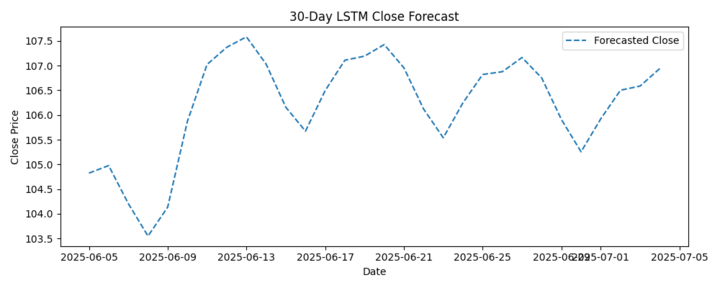
How to Use These Charts in FinTab
After months of tweaking and really serious scrutiny here is how you can essentially plan to use these charts in the FinTab application:
The Data
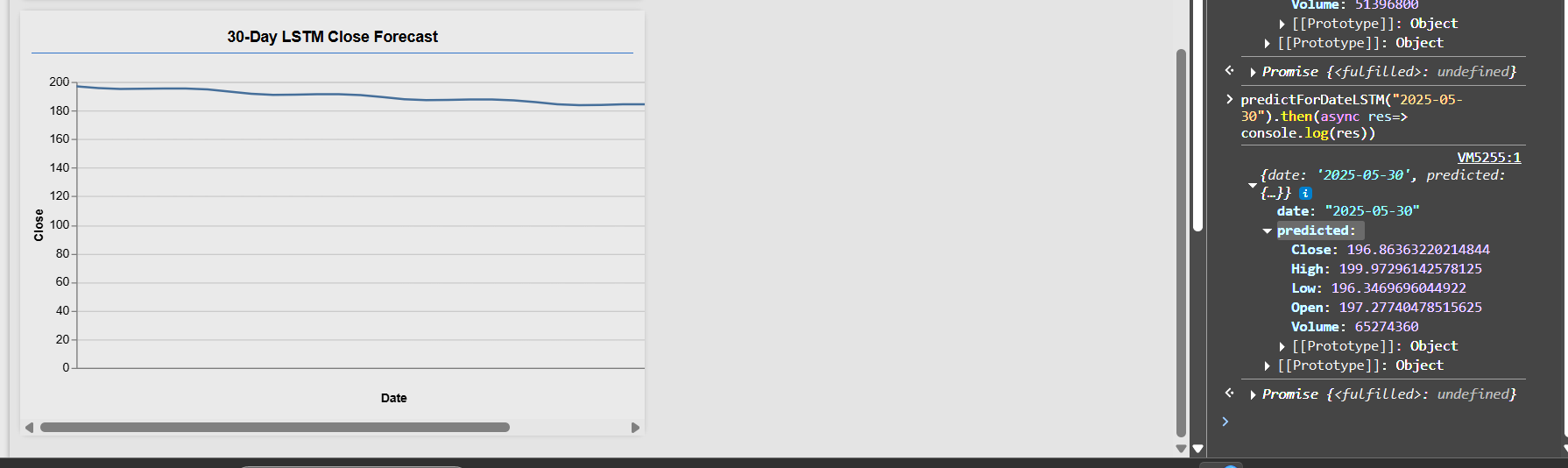
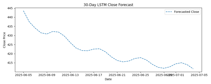
This LSTM model trains on five years of daily market data, including prices, volume, fundamental ratios, technical indicators and calendar encodings. All features are normalized before training. In the chart, upward, downward or flat trends correspond to rising, falling or sideways price movements. The vertical "wave" amplitude reflects market volatility. The model produces single-value point forecasts without built-in confidence intervals.
The Technical Indicators We Incorporated:
- Moving averages smooth out price data by averaging over a specified period to filter noise and identify trend direction or support and resistance levels
- Momentum and oscillators such as MACD, 14-day RSI, Stochastic %K and %D
- Bollinger Bands, defined by upper and lower bands around a moving average to gauge volatility
- Slope of short-term averages, e.g. slope of 5-day SMA and 20-day EMA
- On-balance volume, which tracks cumulative buying and selling pressure
Graph Direction
- Upward trend - A rising line (solid for actual, dashed for predicted) indicates that prices are moving higher, reflecting an uptrend characterized by higher highs and higher lows
- Downward trend - A falling line shows prices moving lower, reflecting a downtrend defined by lower highs and lower lows
- Horizontal trend - A flat or only gently sloping line indicates sideways movement or consolidation, where there is little net change in price over the interval
Waves in Graph
- Wave amplitude (depth) - Amplitude is the difference between a wave's peak and trough in price over a cycle and measures the magnitude of price swings
- Volatility implication - Large-amplitude waves correspond to periods of high volatility and strong swings; small-amplitude, shallow waves correspond to low volatility and muted price changes
- Comparing actual versus predicted wave amplitudes shows how well the model captures market volatility
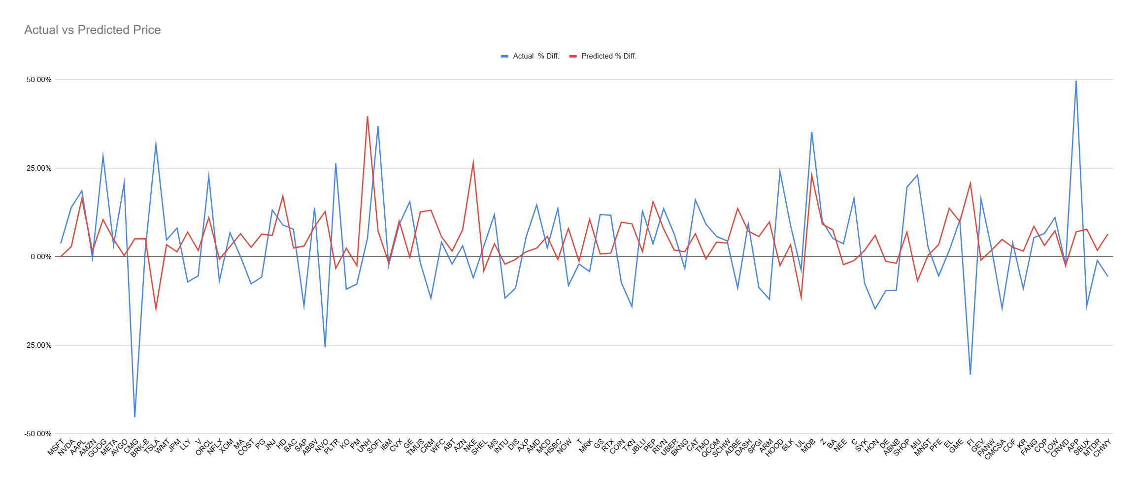
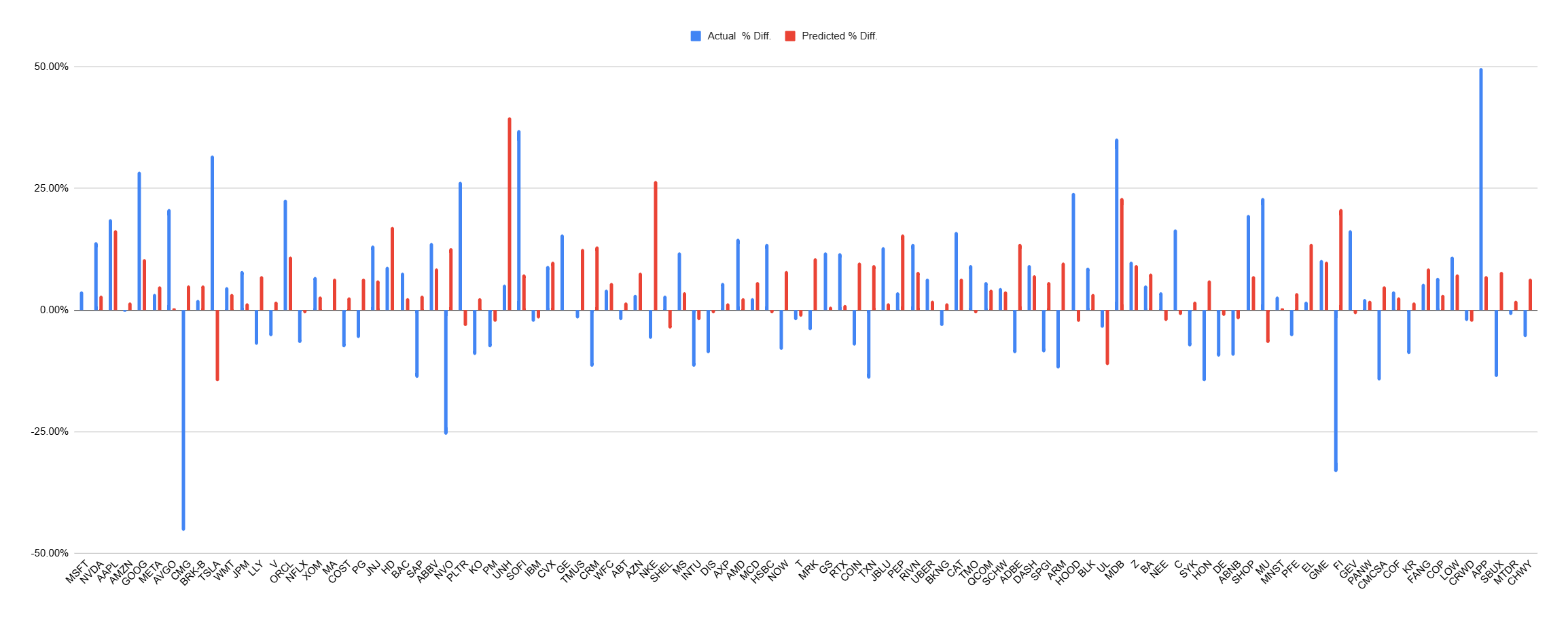
The Real Results
Let's get down to the meat & potatoes, and the real reason you've read this far. How in hell did we actually do? Well the results from our 3 month forecasts are in:
After 3 months we correctly predicted:
A few were bulls-eyes, and the remainder were polite suggestions.
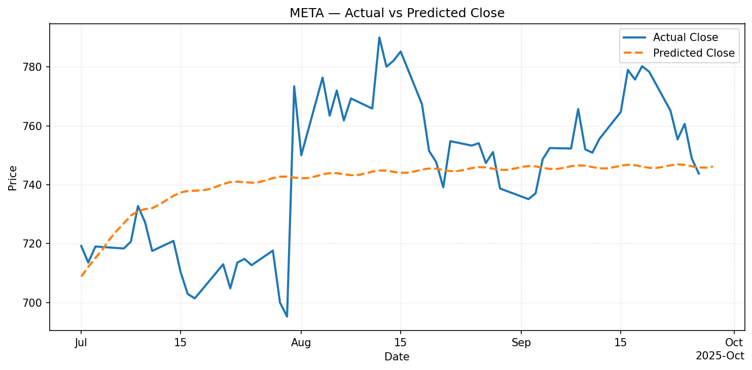
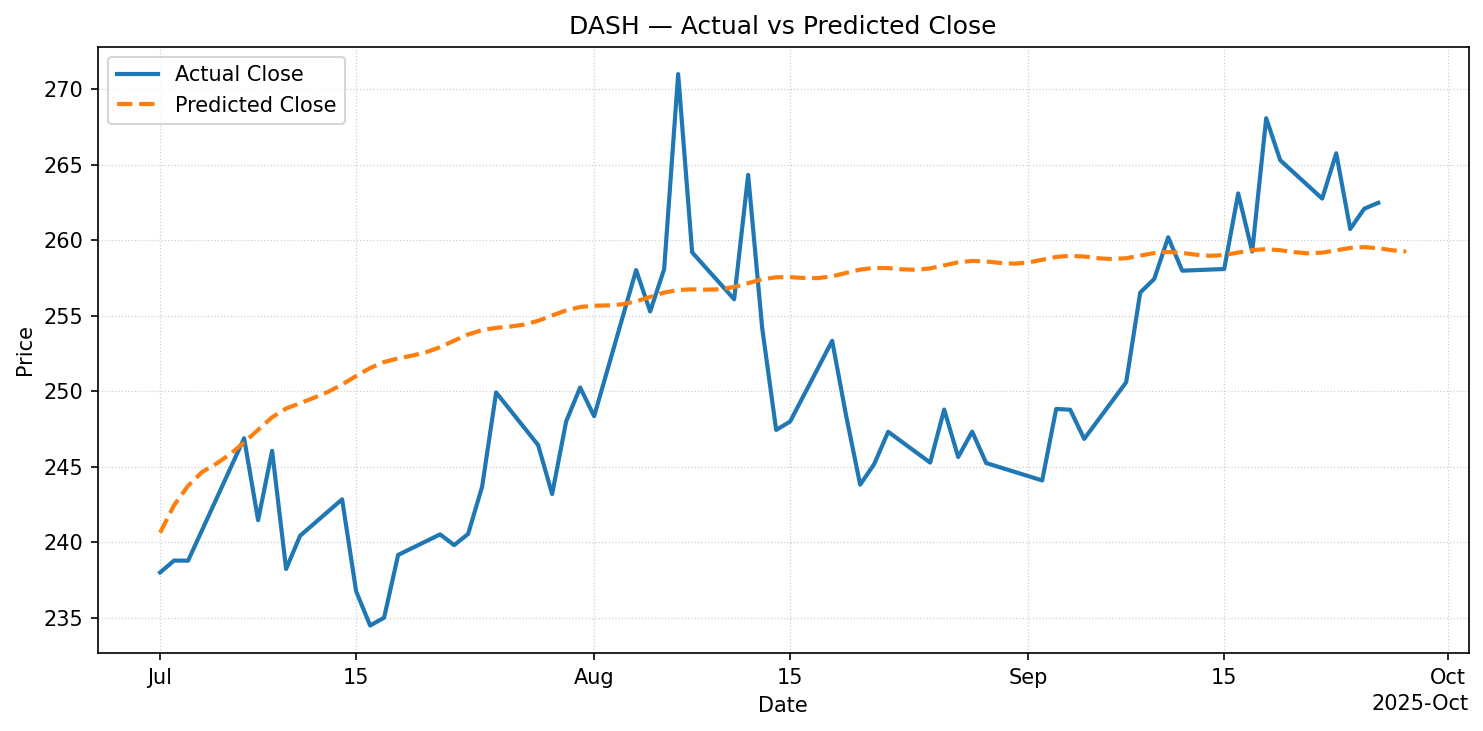
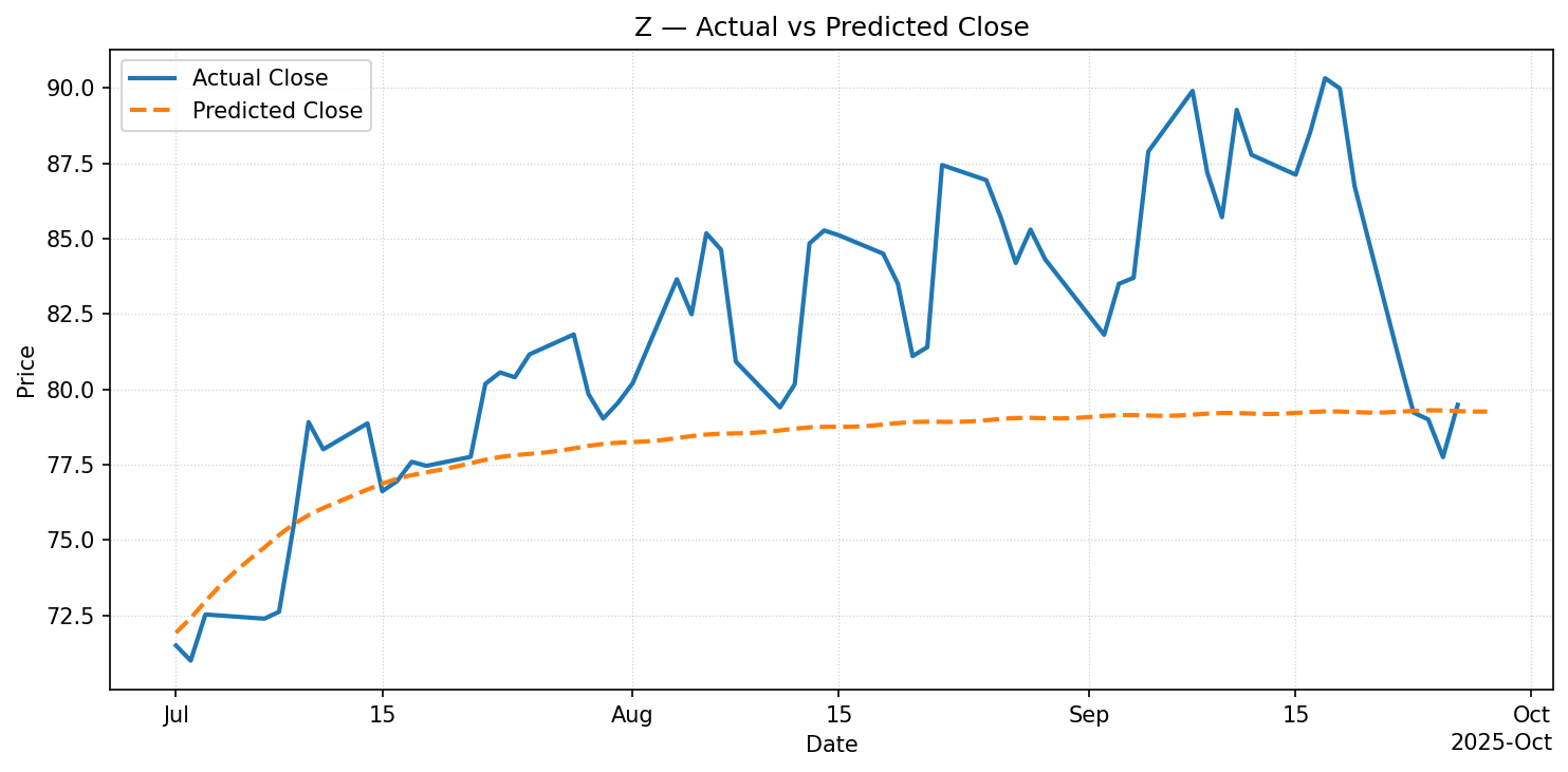
Some in-fact would have required us to rationalize the irrational.
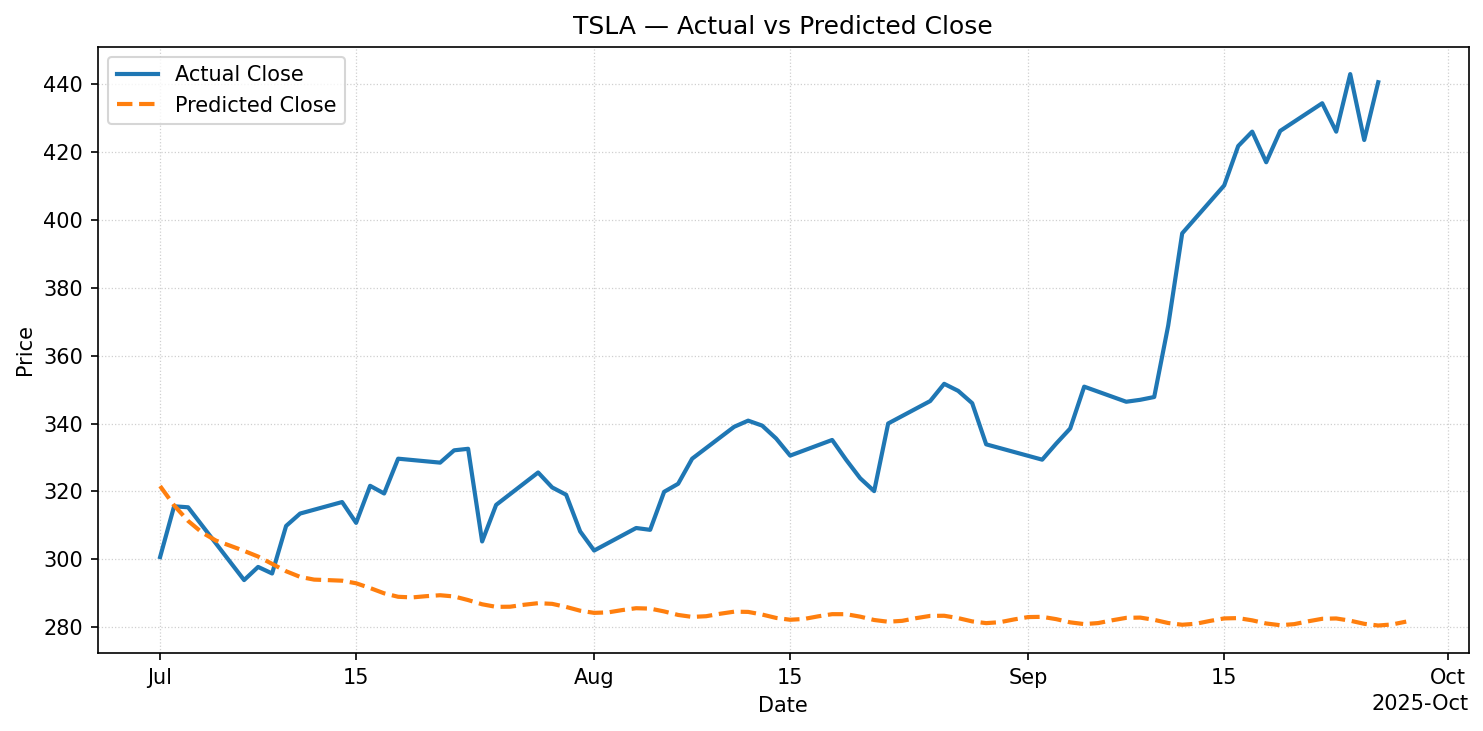
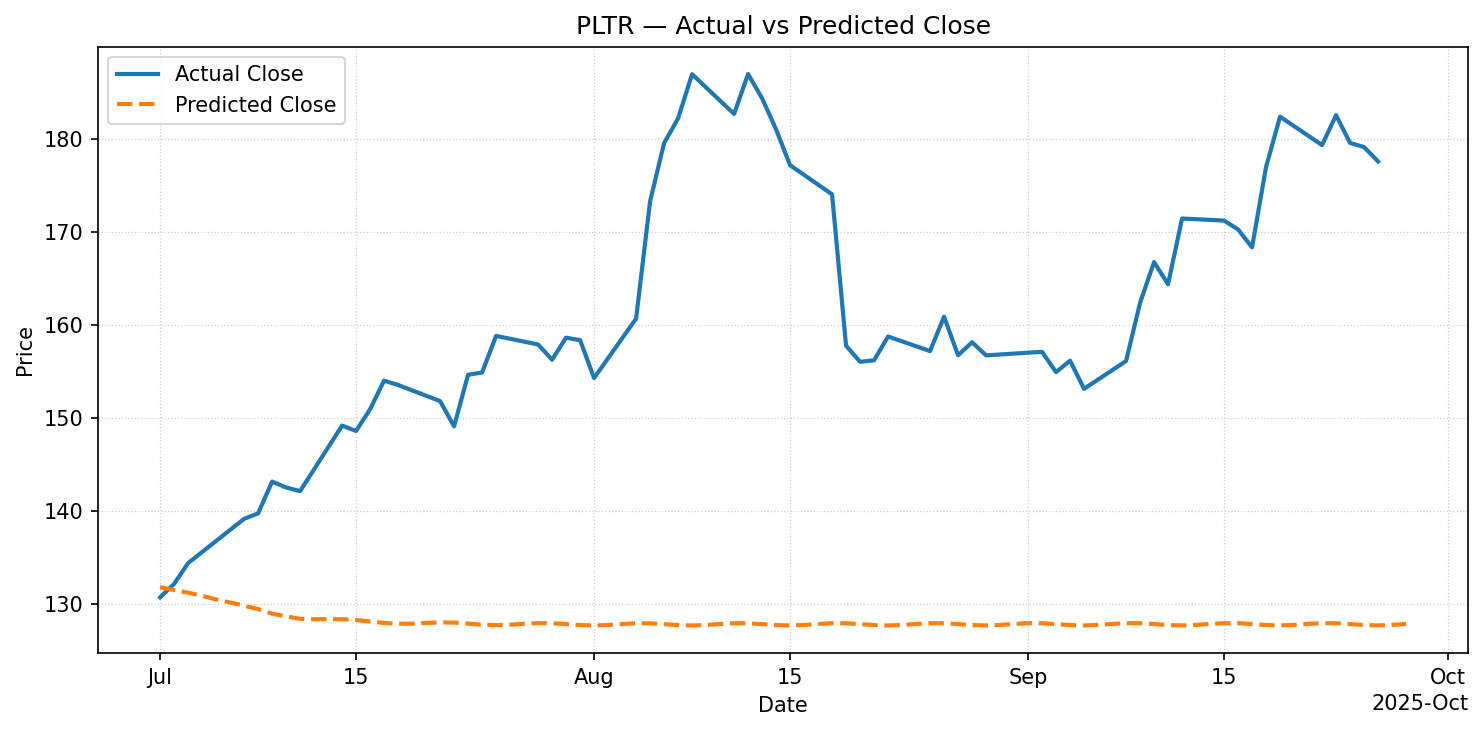
We'll have to reserve further analysis for the academics.
Actual vs Predicted of 100 tickers (Directional % Diff)
Moving Forward
In the FinTab app we do not show predicted prices, but instead this should be used as a tool to help analyze market trends & patterns.
We plan to continue to tweak our algorithms based on performance and some data analysis we've done.... maybe we'll share in our next blog post.
Happy trading!